- Data Continuum
- Posts
- Box Plots are your GO TO for your Exploratory Data Analysis!
Box Plots are your GO TO for your Exploratory Data Analysis!
Box plots visually displays the distribution of numerical data.
Sasi SB
January 02, 2024
Happy New Year 2024 folks! Before jumping into the content of this email I would love to show you all some gratitude for making 2023 awesome!
We were able to help thousands of people in their Data Careers and help them set up their journey!
2024 shall be the year we can take all of this to the next level by helping you land your first Data Job! Stay Tuned for this!
Box plots, also known as box-and-whisker plots, are a fantastic way to display the distribution and key characteristics of a dataset.
They provide a clear and concise summary of:
Central tendency
Spread
Outliers
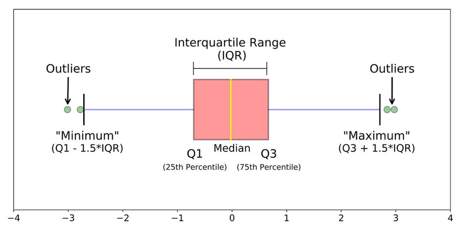
The box in a box plot represents the interquartile range (IQR), which contains the middle 50% of the data.
The line inside the box represents the median, dividing the data into two halves. It gives us a measure of the dataset's central tendency.
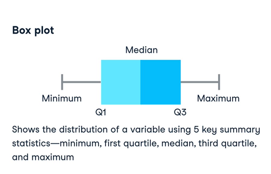
The whiskers in a box plot extend from the box and represent the variability of the data. They usually reach the smallest and largest non-outlier observations.
Outliers, shown as individual points or symbols, lie outside the whiskers and highlight extreme values.
Box plots can also provide insights into the symmetry or skewness of the data distribution.
If the median is not in the center of the box, it suggests a skewness towards the longer whisker. This helps us detect departures from a symmetric distribution.
Comparability
Another valuable aspect of box plots is their ability to compare distributions.
We can create side-by-side box plots to compare multiple datasets, making it easy to identify differences in medians, spreads, and outliers. It's great for exploratory data analysis!

Application
Box plots are widely used in various fields, including data science, statistics, finance, and social sciences.
They provide a quick snapshot of the data's distribution and serve as a foundation for more in-depth analyses.
When to use Box plots?
Remember, box plots are just one tool in the vast world of data visualization.
They are effective for summarizing data, but depending on the context and research questions, other plots like histograms or scatter plots might be more suitable.
Box plots are a powerful visual tool that helps us understand the distribution, central tendency, spread, and outliers of a dataset.
They are versatile, informative, and widely used across various disciplines.
Join the conversation